Firehouse kicked off its inaugural Station Design Conference in Baltimore on Wednesday with nearly 100 participants from all parts of the nation listening to lectures ranging from how to avoid fire station construction pitfalls, to learning about a station built into the side of a mountain in Italy.
Spearheaded by Janet Wilmoth, Firehouse’s Station Design Conference project director, the conference also featured a variety of exhibitors offering their services and products in a mini exhibition in the Baltimore Convention Center.
“I am so pleased with the results,” said Wilmoth as she thanked the attendees and the exhibitors. “In a one-day conference we covered a lot of the basics.” Wilmoth said plans are already underway to continue and expand the conference next year, with the possibility of another event before Firehouse Expo 2015.
One of the presenters in the day-long event was Ted Galante, the principal of The Galante Architecture Studio in Boston. He gave the last presentation of the day titled “The Coolest Fire Stations on Earth.”
From a simple shoebox-shaped fire station in Germany, to a station with a public park on its roof in Taiwan, to a palace like station in Tromso, Norway, Galanteexplained what made each station among the coolest on earth.
“What defines cool, I’m not really sure,” Galante said, adding that he would show some station he thought were cool and the reasons he developed the opinion.
“Fire stations should be firematically correct, well-built and well-funded,” he said as general observations. He said every fire station construction project has its challenges, whether it is in a historically significant location, or to be located on a marginal site, or any of a multitude of issues.
“When you are given two options, take the third,” Galante said. “Take the best of each of the options and make your own option.”
And that’s what the designers of many of the stations he used for illustrations did – one in particular more than any other. That station was built into the side of a mountain in Margreid, Italy, in the heart of wine country.
Trying to preserve as much of the fertile land as possible, the community literally built the station into a sheer cliff of rock, making structure a lot like a James Bond set by enlarging three existing caverns and connecting them with smaller tunnels. Apparatus are housed in two caverns and a third is the administrative office. Galante said gunite was applied in the interior walls to prevent damage and injury from falling rocks.
The idea was innovative in that it preserved valuable agricultural land and provided some intrinsic climate control from being bored into the mountain.
Galante also spoke about a huge budget project in Bergen, Norway, that created a copper-clad, curved fire station that faces a magnificent lake. The station has a training tower with rock climbing walls, a full-size basketball court and bays for nearly two dozen apparatus.
“How would you like to work here,” Galante quipped as he projected images of the palatial structure. He said the station was cool because it used a challenging piece of land wedged between a highway and a water body to its full extent and it considered the needs of firefighters who must maintain physical fitness.
“This is an example of a well-planned station with a huge budget,” Galante said.
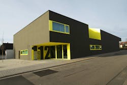
Russelsheim, Germany's fire station is as simple as a shoe box, but uses cut outs and contrasting colors to give it some architectural appeal.Moving to Russelsheim, Germany, Galante spoke about a very simple station design for a volunteer fire department that was not much more than a box with some chunks carved out to give it some architectural interest. The dark brown building used bright yellow accent colors to give the building texture, shape and visual appeal at a very low cost.
The building also used photovoltaic cells on the roof to provide power for the station helping reduce energy costs, Galante said.
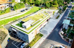
In Taoyuan, Taiwan, a public park was placed on the roof of the fire station and integrated with the land around it to preserve views of a temple and a large housing complex nearby.
“We talk about green roofs here, but this brings it to a whole new level,” Galante said, noting that the roof of that station is truly green with grass and vegetation planted and it is accessible to the public.
“I am not sure this is something we would ever do in this country,” Galante said, noting that the apparatus are completely open with no doors on the bays and only the roof for protection.
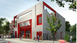
Bringing it back to the United States, he said there are not many truly unique fire stations in the country, with the exception of perhaps one in Galveston, Texas.
Galante said Galveston is prone to hurricanes and the station is designed to weather storms. The apparatus bays open on both ends to act as a bypass to channel the water and prevent damage. The building is poured cast concrete and it is covered with acrylic panels and extruded aluminum framing that is semi disposable, and can be replaced should it be ripped off or damaged in storms.
While the first floor, where the apparatus bays are located have minimal equipment and services, to withstand flood waters, the second floor is essentially self-contained. It is designed to keep critical services operational when hurricanes hit the station which is less than three blocks from the Gulf of Mexico.
Galante said the most important thing to remember when designing a fire station is to work with architects and designers and don’t be afraid of creativity.
“Design is the use of critical thinking,” Galante said. “If you are given lemons, make lemonade.”

Ed Ballam
Ed Ballam served as associate editor for Firehouse. He is the assistant chief of the Haverhill Corner, N.H. Fire Department, and a National Registered EMT. He is also a Deputy Forest Fire Warden for the New Hampshire Division of Forests and Lands. Professionally, he's been a journalist for over 35 years working for a variety of publications, including employment as managing editor of a national fire service trade journal for more than a decade.

